babywear
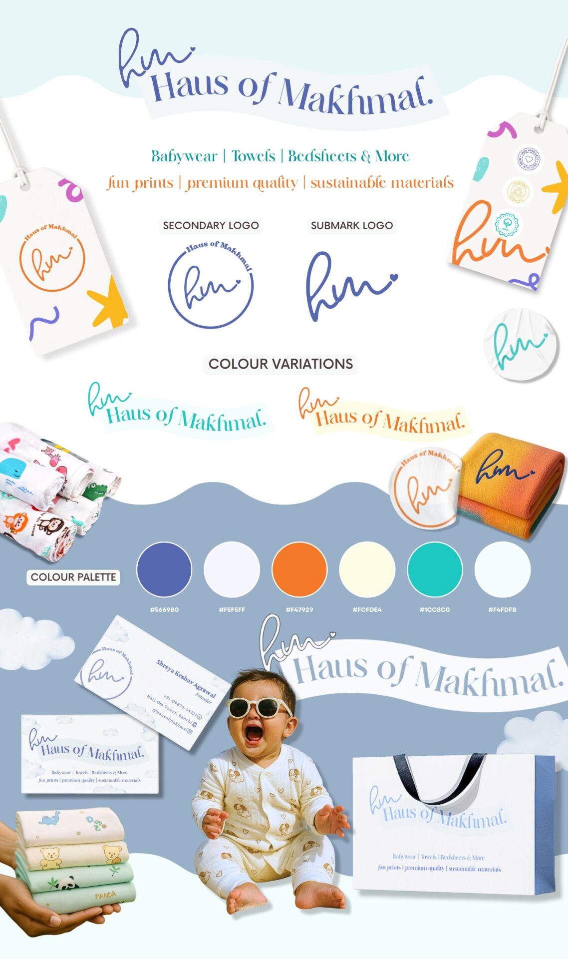
Haus of Makhmal
Haus of Makhmal was designed as a modern babywear brand with an old-soul heart. The visual language leans into softness, warmth, and familiarity – the kind that feels safe, trusted, and lovingly made. The identity was built to feel gentle at first glance, yet structured enough to grow with the brand.
Logo Design
The logo system was designed to be flexible and scalable across packaging, tags, and digital platforms. The handwritten-style monogram introduces warmth and personality, creating a human, approachable feel, while the structured wordmark provides balance and clarity. This combination ensures the brand feels personal yet polished.
The colour palette is composed of soft pastels and muted tones to evoke calmness, trust, and reassurance. Subtle accents of warmer hues add a sense of playfulness and joy, ensuring the brand feels child-friendly without appearing loud or overstimulating. The balance between cool and warm tones allows the identity to feel both soothing and cheerful, appealing to modern parents while remaining timeless.
Brand Board